One thing I've aimed for with this project is keeping it very open ended.
Is this project a video game? Maybe.
Is this project a comic? Could be.
Is this Project a TV show/Movie? Why not?
Is this project a set of action figures? The skys the limit.
The pieces I've done so far, mainly the character model sheets and the designs could be interpretted in multiple ways.
Video games, animation, comics and action figures all use character sheets, and because of this, the art I'm doing could be used in many different ways.
I'm trying to fill all four types of output, which so far, I've done an animation for the TV Show/Movie outcome, and for the video game outcome, I could revamp the poster I'm making into a game cover.
For the comic outcome, I could do a front cover for a first issue, and for the action figure outcome, I could design a backing card (The cardboard part of an action figures packaging, which usually has a lot of information on it.) for the figures, and do both the front and back.

Better check yo'self before you Shrek yo'self.
Sunday, 25 May 2014

FMP - Research: Milton Knight's Robotnik
Research: Milton Knight's Dr. Robotnik from Adventures of Sonic the Hedgehog.
(NOTE: I don't know what happened to the text on this post, sorry.)
Dr. Robotnik is the main antagonist of the Sonic the Hedgehog series, and in recent years, he's been called 
(NOTE: I don't know what happened to the text on this post, sorry.)
Dr. Eggman, but back in 1993, DIC was commissioned for a US Sonic the Hedgehog TV show.
 |
| The design of Dr. Robotnik in the games during the early 90's. Agruably, it's a very simple design, round in look and with very little cartoon to him. |
 |
| The model sheet for Dr. Robotnik, I really like Milton Knight's comments on how to create the character. |
 |
| The second sheet, focusing on his rotund body. Once again, I get a chuckle out of Knight's comments and guides to drawing the character. |
 |
| The character was rarely restricted to the round shape of his default pose, his body could be stretched into interesting poses and looks, but usually bounced straight back to fat afterwards. |
Dr. Doomcough is similar to this in my project, as he's also a ridiculed figure for his height, but still strikes fear into certain people.
 |
| Red Baron Robotnik, just something to leave you with. Plus I like the look of him here, kinda like Doomcough. |
FMP - Research: Doug TenNapel
Research - Doug TenNapel (Artist: Comics, video games and TV/Movies.)

He created Earthworm Jim, The Neverhood, and more recently Armikrog.He is one of my idols for the way he see's his work. His catchphrase and reason for his career is "I like to Draw.", and personally, I agree that could be the only thing that can explain someones art.
He always carries a sketchbook around with him that he fills with ideas, and he's filled hundreds of sketchbooks over the years. Whilst not every idea is used, some of his most famous creations, such as Earthworm Jim and The Neverhood started as small sketches in his books, and eventually he would develop further ideas for these creations in these sketchbooks.
 |
| One of Dougs most famous creations, Earthworm Jim. He started out as a simple doodle in one of Doug's sketchbooks, and would go on to be one of the most iconic gaming, TV show and action figure characters of the 1990s. (This image isn't his first sketch, it's one of his more recent images, created with sumi ink.) |
His favored medium is either black sumi ink, which he uses in almost every comic and piece he creates, or clay, as he used in The Neverhood and more recently, Armikrog.
He's said to like using sumi ink as it's both controlled and crisp, but can also be really erratic, but not to the point of being bad. (He once used digital as a way of inking his comics, but said he 'felt like he was cheating on a lover', and quickly returned to sumi ink.)
When inking a comic, if the brush had excess ink on it, he'd use it to fill in the frame of the comic, making thick, black lines, and when the ink had ran thin, he'd return to the finer parts of the image.
 |
| The Neverhood, arguably Doug TenNapel's second most popular series. The characters and world were made entirely of clay. |
FMP - Character Design: Model Sheets #2 (Testing a professional layout.)
 |
| Joshua Macy's (Formally Justin Branden) Model Sheet. Starting with him, I've gone for a more 'professional' look to the sheet layout, similar to how Model Sheets look like in a commercial project. Adding a sheet number, visual aids and animator notes really helps. |
 |
| Susan Doomcough's Model Sheet. Same as above, with trying sheet numbers, visual aids and animator notes. |
Sunday, 18 May 2014
FMP - Final Piece: Villains .INC Poster WIP #1
NOTE: I currently don't have internet at home due to switching from Sky to PlusNet and something going wrong in the process.
We might not get it fixed until the end of next week, so blog posts will be very infrequent until then.
I'm creating a poster as one of my final pieces for this project, and I'm planning to get it printed in a commercial poster size. (A0)

FMP - Research: Character Sheets #1
This is Research.
I didn't create any of these pieces.
I'll be doing character sheets for one of my final pieces, so I looked into various character sheets from across the digitized world.
 |
| Leo A-Frame, created by LuigiL of deviantART. http://luigil.deviantart.com/art/Leo-A-Frame-Model-Sheet-327488603 I like the look of his characters and also the colours he uses. |
 |
| 'Original Character', created by Asira-Chibara. http://arisa-chibara.deviantart.com/art/Original-character-model-sheet-ROUGH-Naga-371542776 |
 |
| Mindf**K byKen Capelli. (Found on FlickR) |
 |
| Scar's head from The Lion King. Drawn by Disneys Animation Department. I like the combination of sepia, blue, black and red colours on how they drew his head, it brings out the look of the character. |
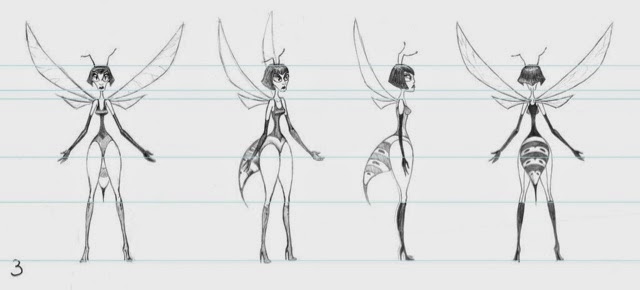 |
| Wasp Villain by AnnCocoPuff by deviantART. http://anncocopuff.deviantart.com/art/Wasp-Villainby-AnnCocopuff-Character-Model-Sheet-351178286 |
 |
| Character by Ocarian of Polycount.com |
 |
| Gadget Hackwrench from Chip n' Dale: Rescue Rangers. Drawn by Disney. |
 |
| Hot Rod from Transformers: The Movie (1984) Drawn by Toei Animation to help with animating the character. I like how refined it looks, which isn't a surprise from a Japanese animation company. |
 |
| Earthworm Jims structure sheet by Doug TenNapel. I always loved Doug's characters, and the structure and composition of this sheet really gives me an inside look on one of my favourite characters of his. |
 |
| Bluto from Popeye. Artist - Whoever drew Popeye. |
 |
| Jasper and Horace from 101 Dalmations. I really like how the characters look, and they're both very expressive. |
 |
| The Lad From Space Model Sheet by Kevinbolk of deviantART. http://kevinbolk.deviantart.com/art/The-Lad-From-Space-Model-Sheet-80915886 |

FMP - Character Design: Doomcough Model Sheet MKII
As you might recall with a previous post, I attempted a model sheet of Doomcough as a test to see if I could do a decent looking sheet.
I'm not entirely happy with the first sheet, Doomcoughs eyebrows were too big, he looked to slouched and the proportions weren't very good.
Also I think his cape is important too, which I left out.
Without further ado:
I followed my designs more closely whilst drawing this version, making sure to get his proportions more accurate and also adding the cape which makes him look bigger and more imposing.
I also designed an insignia for the back of his cape too which could also be used on his machines and stuff.
I'm hoping to have a model sheet for for all the characters, six villains and two heroes by the end of the project, so I should get a move on.
 |
| The first model sheet, I dubbed it MKI. |
Also I think his cape is important too, which I left out.
Without further ado:
 |
| Dr. Doomcough Concept MKII |
I also designed an insignia for the back of his cape too which could also be used on his machines and stuff.
I'm hoping to have a model sheet for for all the characters, six villains and two heroes by the end of the project, so I should get a move on.
Subscribe to:
Posts (Atom)